Mention the words Farrow and Ball to any decorator and they will shake their head with a derisive snort, claiming it’s average-quality paint with a hefty price tag, marketed for foolish, middle-class women, with too much time on their hands.
So naturally, being a foolish woman and having too much time on my hands, I developed a craze with Farrow and Ball that very rapidly spiralled out of control.

It began with a simple task to paint the bathroom of my rental flat; the last tenants had moved out after three years and it needed a lick of paint to smarten things up. I pottered down to Homebase, naively thinking I’d just grab a pot of any old paint and slap it on. But when I headed down the paint aisle, my eyes were inexplicably drawn to the enticing brown sample pots of… Farrow and Ball.
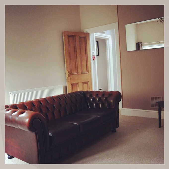
I’d already had a taste of F&B in the past, having painted the chimney breast of my beloved flat in the strangely-named Dead Salmon, a kind of pinky brown colour – which now I come to think of it, actually does resemble the colour of out-of-date fish.
For the bathroom, I wanted a shade of blue. But what was it to be? Parma Grey, Lulworth Blue, Blue Grey? The choice was boggling.
After much deliberation, I plumped for Borrowed Light – a beautiful pale blue. I loved it.

It was at that moment that I crazily decided to paint my whole flat in Farrow and Ball – a decision that would go on to cost me several hundred pounds, many hours of labour, and untold exasperation to the long-suffering husband.
F&B connoisseurs will tell you that there’s a depth to the paint that Dulux and Crown just can’t compete with. I’m not sure this is strictly true but this is what I kept telling myself, in order to justify the paint pot splurge.
I began carrying around a colour chart of F&B and would sit studying it several times a day, with all the intensity of a Truly Crazy Person. Friends, long since tired of my painting patter, attempted to stage an intervention. But when they snatched the paint chart off me, I began rocking in the corner, muttering ‘Elephant’s Breath, Elephant’s Breath’ repeatedly, until they reluctantly placed it back in my palm.
Remember that 90s game show called You Bet! hosted by Matthew Kelly, in which contestants had to complete unlikely challenges such as memorising all of the road signs in the UK? Well, I could easily recall all 132 Farrow and Ball colours, in order, and come away with the star prize.
Some evenings, I would roar off on a whim to the Harrogate F&B shop, to stare dreamily at the paints on display. The shop assistant there became my new best friend and I started phoning her at all hours of the day just to chat about paint: ‘Do you really think Rectory Red would go with Oval Room Blue? Really? I was thinking that too! Ha ha haaaa!’
I was clearly unstable.
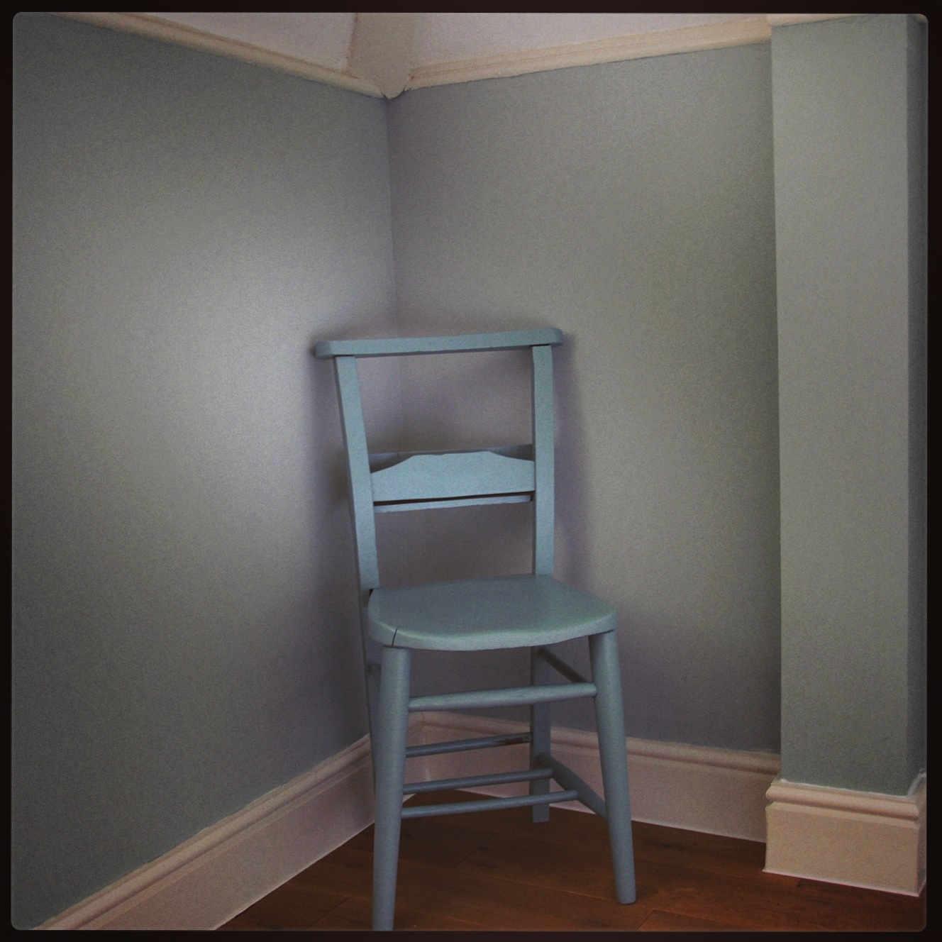
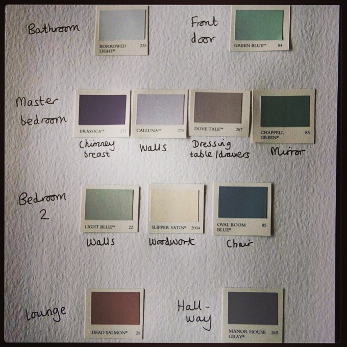
The spare bedroom was painted in probably my favourite colour: Light Blue (a kind a blue-grey that changes with the light of the day), complemented by Slipper Satin on the woodwork.

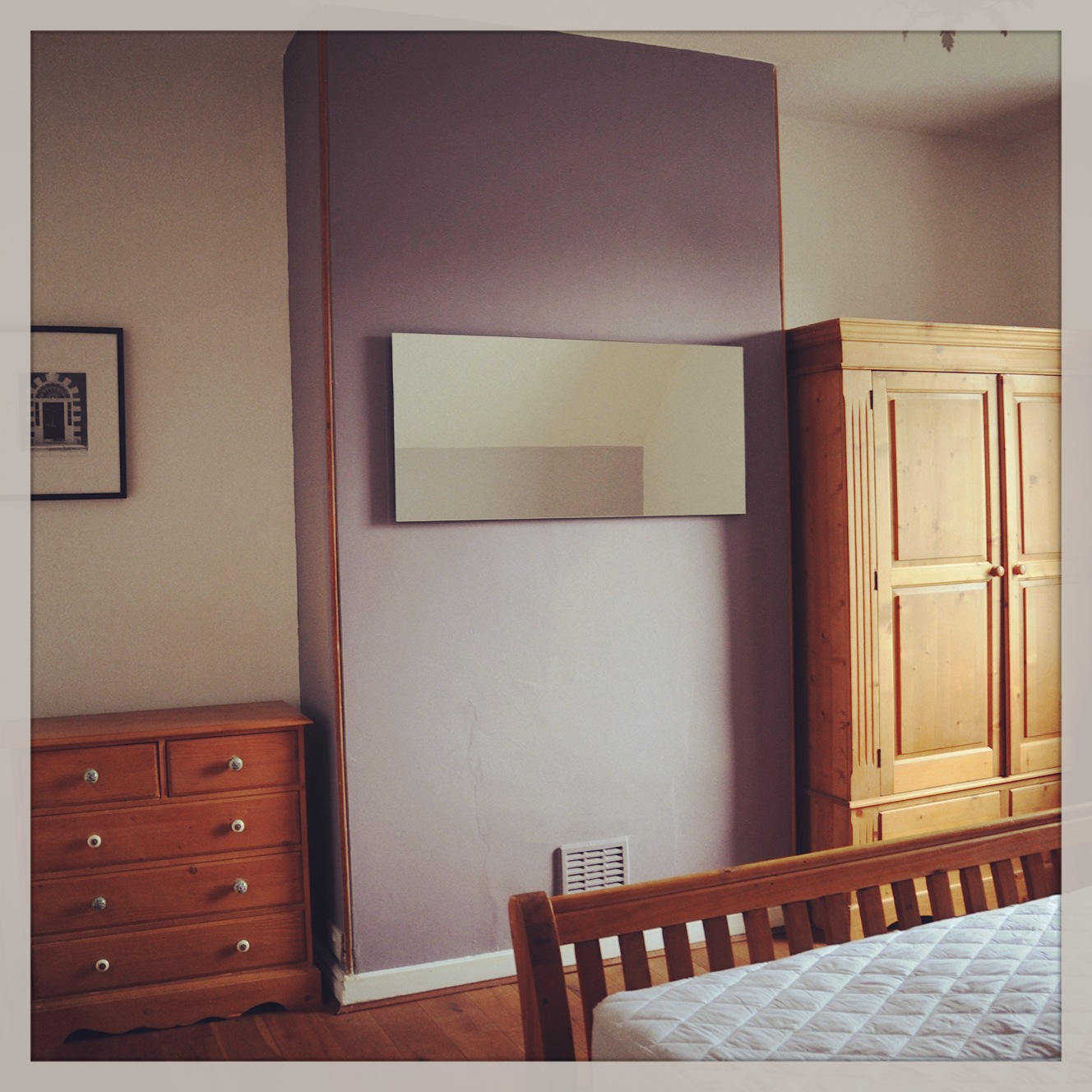
Manor House Grey framed the landing, while the main bedroom had a palette of purply Brassica and Calluna – the colour of ‘Scottish heather’.

Finishing the walls, I was in too deep to end things there – so I began feverishly painting the furniture. Any wooden item that wasn’t nailed down was at risk of being ‘Farrowed’ in my upcycling mania.


The worn church chairs were painted Oval Room Blue and Chappell Green respectively, and a tired, old dresser enjoyed a new lease of life with a hearty lick of Dove’s Tail.

Even the front door didn’t escape – acquiring several coats of Blue Green and a shiny new number 5.
My irritating neighbour Greenclaws came sniffing around and was so taken with my efforts that he gaily skipped off to Homebase himself and returned clutching a tin of Middleton Pink (probably to match the garish plastic lobster that adorns his kitchen wall).
And then it was over.
The paint pots were stacked in the attic, a colour scheme was thrust in the hands of my new tenants, should they feel the need to so some touching up, and I reluctantly trundled home with my paint brush.
For about a week, I had to go cold turkey, tossing in my sleep and chanting, ‘Mizzle… Mizzle – it’s reminiscent of a West Country evening mist…’
Two months on, I think I’ve just about recovered.
I passed a F&B shop in Marylebone last week. And even though every bone in my body wanted to rush in, ambush the woman and yell, ‘Do you really think Arsenic goes with Brassica?!’, I managed to keep on walking.

Having recently painted my bedroom in Dorset Cream and Farrow’s Cream, my breakfast room and conservatory in Breakfast Room Green and about to paint my lounge in Dead Salmon and one other undecided colour (Joa’s White? Dimity?? Off White???), I have to agree 100% that there is indeed a depth to this paint which makes it worthwhile spending the money – I intend to live in my house for the rest of my natural life, and it’s worth every penny! Oh, almost forgot, I even painted the ceilings (which no-one ever looks at) in All White 🙂 Obsession? Maybe.. Quality? Definitely!
But what about Cornforth White?!? We just finished having our whole house painted that colour and we love it!
Can I ask did you use the recommended farrow and ball dark undertones on your manor house grey paint?x
I have to confess I didn’t. Even as a die hard F&B fan, I don’t think it makes any difference!
Thank you that helps alot the colour is still beautiful x
Hi there, LOL! 🙂 My husband and me moved to a new rental flat last summer – and after browsing some british interior design magazine the faroww&ball-ism totally took over. Can safely say it’s not just a female thing – my hunsband showed major ambition in discussing Manor House grey versus the other fabulous grey shades (grey!!!??? hello?). Up to this day, it lingers – when we entered the very lovely decorated room of a beautiful shop both of us whipered in awe: “This must be Elphant’s breath. For sure.” 🙂
BTW: love your self-ironic storytelling style – and the wordpress theme, too! 🙂
Thanks Kristin… I have to say the husband has yet to share the passion; even less so after spotting myriad receipts from the F&B shop!
Ha, this is very funny! I am also in the obsession, though haven’t painted anything yet….just picking out the colors…LOL. But I have sample colors all over my walls….I want them ALL. So far, I am in love with Breakfast Room Green. The Dead Salmon looks so good in your pic! Can I ask you, does the Dead Salmon look too dark or what does it look like at night with no sunlight?
Hmm- an interesting one. Dead Salmon was my entry level F&B, nearly 10 years ago. I’m not sure how much love it still have for it. It’s kind of a deep browny pink. It works but not in huge quantities. Have you tried Brassica? I think it’s usurped Dead Salmon a bit (and also goes beautifully with other newer kids in the block like Calluna and Dove Tail).
Pingback: Everybody Needs Good Neighbours | My Family and Other Oddities
I have just read this whilst googling cornforth white – i am looking for the perfect light grey neutral and think i have found it! hooray!………I loved your story about getting hooked on Farrow and Ball – really made me laugh and I am pleased that I am not alone in the F&B obsession…..
Hi Rosemary… Funnily enough, this old Farrow and Ball post still gets more hits than any other blog post I’ve written; we are not alone in the obsession! Good luck with the decorating. Can’t beat a bit of F&B…
Hi, Just drying my tears after reading your F&B obsession blog. I laughed so much I could hardly breathe and when reading it to my husband who could only pick out a word or two he was laughing too saying ‘this is you’! And it is with a cupboard full of sample pots (who can resist them, they are sooo adorable and alluring with the promises inside!) and also living with an out of control amount of painted samples on the walls. Head is spinning, should I go for Mizzle, Blue Gray or Pigeon?? Or the other way, Slipper Satin, Old White, Lime White…or Cornforth White….Purbeck Stone…….Setting Plaster looks good…etc etc. During the course of a day I can go through them all and feeling that I have made my decision, yeap, done and dusted…relax…then the cold sweat sets in and I start again..revisiting, driving like a manic to the F&B hub for yet another sample when I felt I turned a leaf with an inspired new look at the paint chart which is now looking worn out and so increadible tired. I thought I was the only one with this level of madness it is comforting to know I’m not but I can’t wait until I have finished the house, then I will burn my paint chart and see the sooty flakes dance their way away from me and I will be free!! Lol thanks for a great blog 🙂 Anni x
Love your blog. Just in the middle of said phase but following a cost cutting top tip of a decorator who fits perfectly into mould as mentioned in a previous post – he thinks Johnstnes is far superior for application, coverage and durability. They are much cheaper too! The best news though is that they offer to make up Farrow and Ball shades! Okay they aren’t the same chalky paints but believe me they look beautiful and personally I can’t tell the difference – the impact is the same. So far I’ve painted a feature wall in my lounge Parma Gray, a feature wall in my hall Cooking Apple Green, staircase and landing Borrowed Light and bedroom Calluna. Can’t wait to crack open my Pelt for behind my bed head tomorrow. I’ll be off to get some eggshell for my furniture after that but need to ponder a while longer on the shades! Don’t want this delicious phase to ever end!
Hi Claire, I’m pleased to have recruited another F and B obsesse! Thanks for the tip on the Johnsons paint matching. I’m very intrigued by the behind-the-bedhead Pelt. Love a bit of heathery Calluna too. Go steady on the furniture painting through; if it spirals out of control, anything that isn’t pinned down… bedside tables, coffee tables etc. could get Farrowed!
hysterical–i feel your pain
I have to laugh – I’ve got the bug too ! I have three paint charts in various handbags 🙂 funny isn’t it !!!
The obsession never really leaves. With a new house to decorate, I’m colour-carded up and back in the thick of it!
I a F&B novice but am biting my nails trying not to make a very expensive wrong decision about what colour to have my new kitchen units painted. I’m surrounded by tester pots etc., and have a multitude of different neutrals painted on lining paper and stuck up around the kitchen. And I just can’t decide so any help appreciated.
I don’t want grey (husband says so), elephant’s breath looks too pinky, stony ground looks khaki, mouses back looks yuk so I’m back to choosing a cream or light beige ish neutral. Can anyone out there suggest a colour which we shouldn’t get tired of looking at and is classic enough to stand the test of time as I’m not likely to have another new kitchen for a very long time. And repainting the new one won’t be an option.
Sue- I’ve just realised as a fellow Farrow addict you reached out for help and I didn’t reply. So sorry. I hope whatever you painted your kitchen went okay. Latest news is that Purbeck Stone is an interesting alternative to the ubiquitous Elephant’s Breath…
Well this is hilarious!
Funnily enough, I was googling if there was a Dulux equiv of F&B Dorset Cream. I blog too and am also in the Harrogate area! Pleased to discover you, vey funny writing!
Natalie X